Turning a flagship launch into a product page customers understood
+36%
BT Halo product page conversion uplift
+41%
landing page to order journey
My role
Content designer on a multi-disciplinary team, and the person standing between marketing's messaging guide and the live page. I audited and rewrote the launch messaging, ran the group writing and crit session with marketing and brand, built the prioritised hierarchy for the Halo 3 vs 3+ comparison table, and co-created the wireframes and layout with the product designer.
Timeline
January to February 2021
Team
Product designer, engineering, and stakeholders across marketing, brand, legal and product.
Main outcome
At soft launch, Halo 3 and 3+ conversion rose 36% and 41% more users moved from the page into the order journey, measured against the previous six months. Three colleagues nominated me for BT Digital's Creative Collaborator award, which I won.
The problem
BT was about to launch Halo 3 and 3+, which added a 4G back-up device and wi-fi extenders to the broadband package. It was a flagship launch and the product page had to carry it, with business targets of 70% Halo 3 regrades, 30% Halo 3+ regrades and a 10-point rise in CSAT.
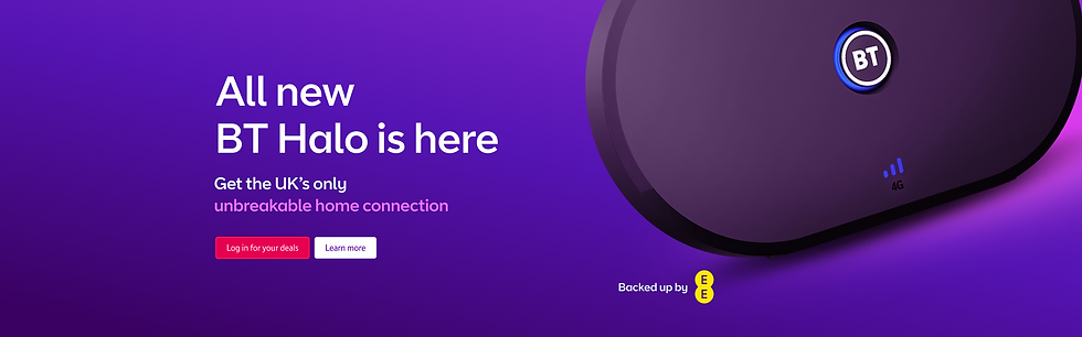
The starting point worked against users. Most customers didn't know what Halo was. Marketing had issued a messaging guide we were expected to work from, and it was technical and jargon-heavy ("Hybrid Connect... for an unbreakable home connection"). Headings led with product names, not what people got. And there was no research resource to test anything before soft launch.
The brief was a product page that was user-centred rather than a marketing campaign page. My job was to make that true in the content that we delivered to users.
What we knew
Research
Earlier user research gave me two things to build on. Comparison tables helped people see the difference between products. And five things mattered most to people choosing broadband: a reliable connection, strong wi-fi in every room, a back-up if the line went down, a fair price, and expert help when something broke. I also had user feedback showing people didn't understand our existing language. That evidence did most of the work in the stakeholder room.
Product data
Six months of page performance before the redesign. Every result below is measured against it.
Constraints
A marketing messaging guide we had to start from because this was a key launch for BT. Close scrutiny from marketing and brand. No user testing before soft launch, and a launch date that was set in stone.

My approach
I treated the messaging guide as a loose guide, not as signed-off copy. Its own headings would not make sense to users: "Hybrid Connect", "Future-proof", "Customer promise". It led with product names first, with no clear user benefits.
I rewrote every section before I took it to anyone. Each heading now led with the outcome. Each feature was tied to something a person would recognise, so "Smart Hub 2" became "Our most powerful wi-fi hub" with controls "so you can pause the internet and manage your family's screen time". Sentences got shorter and active. The product names stayed, but after the benefit.
Then I ran a group writing and crit session with marketing and brand. I walked through every edit and why I'd made it, and asked them to pick holes in the copy as the subject matter experts. Where they wanted the original wording back, I showed them the user feedback that users couldn't understand it. I used evidence to establish the points I was making.
The same benefit first pattern became the structure of the page. With my product designer, I wireframed the layout around user benefits rather than product names, and every module title followed one formula: what you get, then the feature that gives it to you.


What I chose and what I ruled out
Rejected
Shipping the messaging guide as written
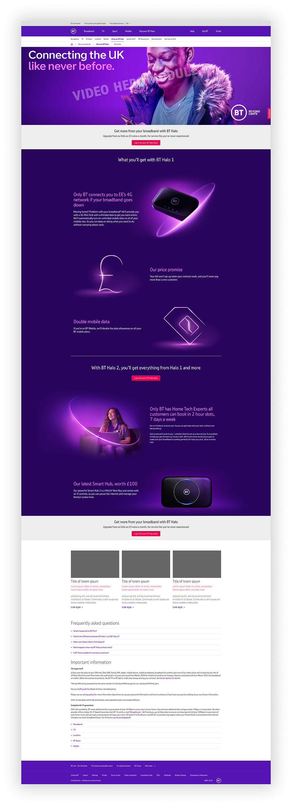
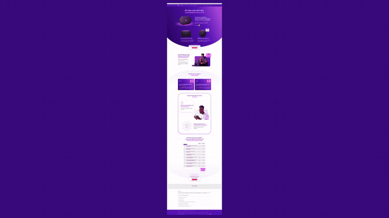
The easy option on a flagship launch was to use marketing's approved wording and let brand sign it off. The guide led with product names and buried the benefit, so I rewrote it and took on the harder conversations with marketing and brand instead. The before and after designs show what changed, which is further down the page.
Rejected
A conventional comparison table
The standard table listed the features both tiers shared first and left the Halo 3+ extras at the bottom. I built the hierarchy the other way round: the four Halo 3+ features at the top, led by the ones research showed drove the most appeal. It made the stronger product the obvious upgrade and gave the 30% Halo 3+ regrade target a fair shot, without hiding anything from people choosing Halo 3.
Rejected
Winning every edit
In the crit session I took on board stakeholder critqiues and feedback where they knew the product better than I did. Where I had user evidence that people didn't understand the wording, I held the line. Picking which argument to have mattered more than winning all of them, since it's the user that matters in the end.
CHOSE
Shipping without user testing pre-launch
There was no time or resource to do user research before the launch date. We shipped on the strength of earlier research and the stakeholder crit, and treated the launch as the test before we went above the line for marketing.
What shipped
A rebuilt BT Halo product page for launch, over three rounds of design. A benefit-led hero messaging and page sections. The Halo 3 vs 3+ comparison table ordered by previous user research priority: Price promise, money-back guarantee and Home Tech Experts sections, plus an FAQ.
Before
After

Results
At soft launch, measured against the prior six-month average:
36%
41%
+2,000
CSAT increase
relative uplift in conversion rate for BT Halo 3 and 3+
more users progressing from the landing page into the order journey
page views per week
feedback showed positive responses to the reliability messaging and greater understanding of Halo and its features
Both business targets for regrades were met: 70% to Halo 3 and 30% to Halo 3+. User feedback was positive on the reliability messaging and showed better understanding of what Halo was and what came with it.
Three colleagues nominated me for BT Digital's Creative Collaborator award, and I won it. The nominations came from the product designer, a fellow content designer and the product owner:
“I feel that Jordan gone above and beyond to ensure the User needs are kept for front and for helping create great content for the upcoming Halo 3 learn pages”
ketan, Product designer
“Jordan has been a shining star during what's been a pretty difficult few weeks getting Halo 3/3+ launched. He's been under a huge amount of scrutiny, but he's still produced amazing user centred content and collaborated with every stakeholder who has come his way with patience and warmth.”
Lucy, Content designer
“Ketan and Jordan have impressed us all with their collaboration with each other, other designers, legal, marketing, brand and props in order to deliver designs for Halo 3 - constantly pivoting and taking everything in their stride. Their can-do, proactive attitudes while keeping firm on ensuring the customer is at the heart of everything have enabled better relationships with stakeholders and a better outcome for the customer.”
Emma, Product owner

What I learned
Evidence beats seniority. User feedback showing people couldn't understand our language won conversations that a content designer's opinion would have lost. I've used this knowledge on every stakeholder heavy project since.
I'd push harder for testing before launch, even a quick comprehension check on the rewritten copy. Learning from launch data worked here, but there are quick and scrappy ways that I could have gained some learnings.